DUX_A2
Project Profile
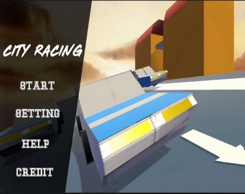
The game is developed based on unity3D and is currently in the grey box stage. Contains a personal menu, personal actual scene, and a group menu
In this phase, all models are created using probuilder in unity, all materials are created using unity materials, and all popup interactions are created using unity's built-in setActive(), so no assets are used in this phase.
The focus of this stage is on the design of UI and UX. Through the high interactivity and easy recognition of UI, users can bring good user experience. Users can pause and open the setting or help pop-up window in any interface (no actual functions are developed in this stage). At the same time, by setting the transparency of the panel and the Angle of the camera, the user's attention can be well controlled, thus increasing their experience.
After testing, the unity project is based on WebGL and can be accessed well on devices such as tablets and computers.
How to use:
Menu:
Start -> Level(Scene) Selection ->Actual Scene / Group Menu
Setting -> Setting pop-up window( Setting Panel( setActive() ) )
Help -> Help pop-up window(Help Panel( setActive() ))
Credit -> Keep track of the people or websites that contributed to the work(Not implemented in A2)
Actual Scene:
Actual Scene -> Pause, Control Panel(Rotate, Move, Scale)
Pause -> Return(Actual Scene), Setting, Menu

Comments
Log in with itch.io to leave a comment.
I particularly appreciate your attention to detail and attention to user experience. The architecture of the game's own grey box model is both scientific and visually appealing. The navigation bar is readable with text and seamlessly blends into the game scene through clever transparency controls. The non-intrusive UI design is excellent. In terms of interaction design, the feedback mechanism built is excellent. Every action gets an immediate, clear visual response.
However, I think there are still some shortcomings, the color contrast of the current button is slightly strong, and the overall visual texture needs to be improved. And some UI design occupies a large space, should consider the reasonable distribution of ui layout size
Overall, the game has shown a high degree of completion in the UI/UX design, simple but not simple, and a good balance between functionality and aesthetics.
As a grey box project, this project is well done, with good UI design, and the UI can be automatically adjusted for different resolutions. However, the shortcoming is that when the car is moving, there is the phenomenon of wearing the form and floating, I think it can be improved.
The current completion level of the gray box stage is impressive! The logical hierarchy of the UI framework is clear, such as independent management of the main menu/settings/game interface, excellent button interaction feedback, and smooth navigation. The basic functions are sound, and the completion rate of modeling is particularly high
However, it is recommended to focus on optimizing the smoothness of operations in the next step, such as reducing button response latency, unifying navigation logic, and doing a lot of resolution adaptation. The functionality can be limited, but it must be refined. Polishing the core experience will be more conducive to subsequent development. Continue to maintain this progress, but pay attention to the refinement of details.
Thanks for Mr. Tian's suggestion, I will improve it in A3